
Portfolio
Journale
Branding, Marketing
Brief:
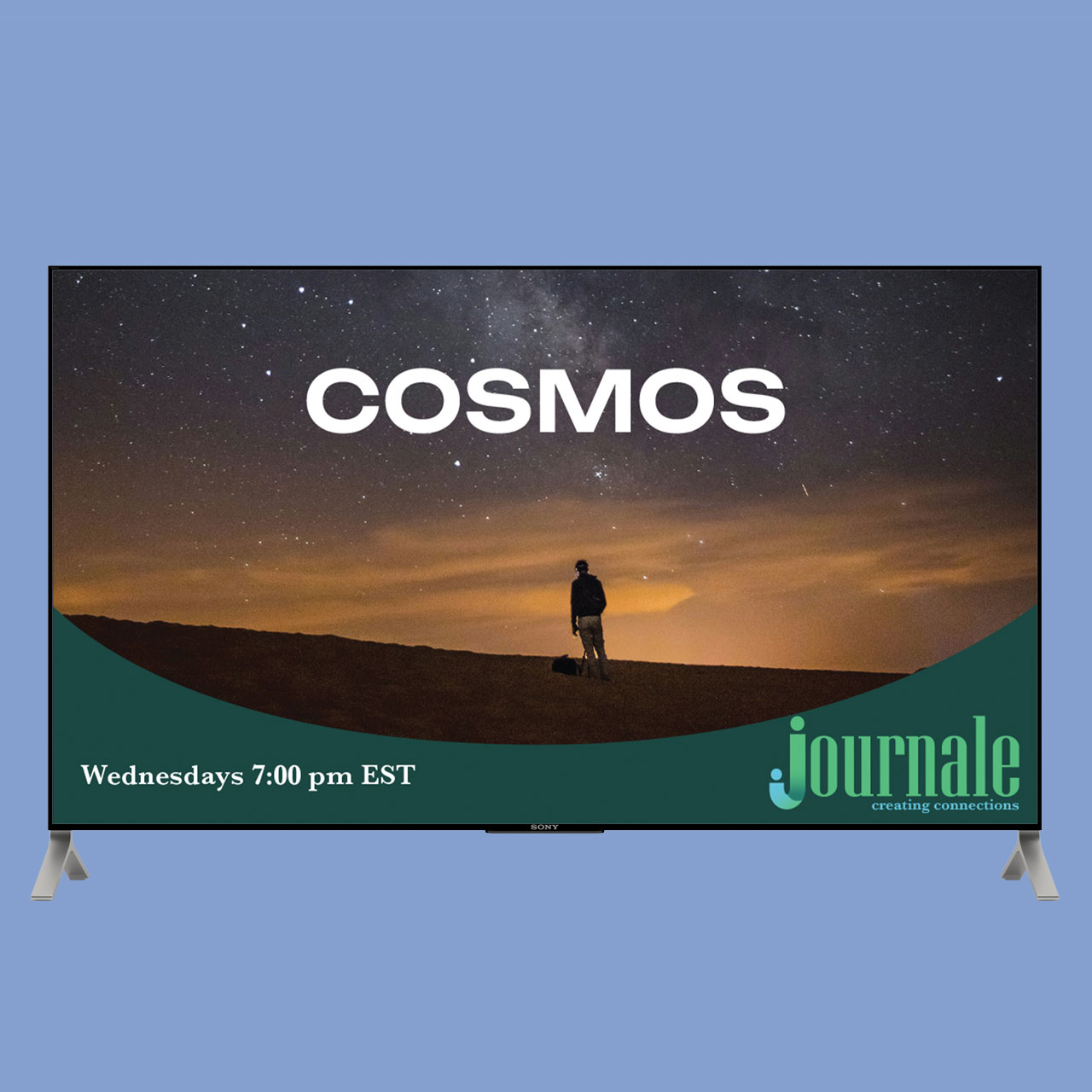
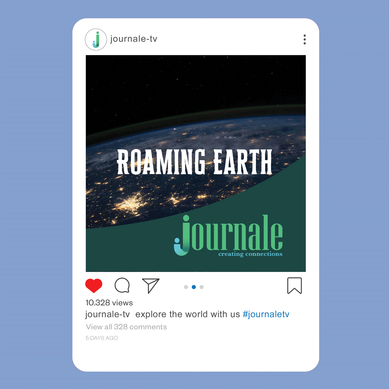
Create a logo and advertisement for a new TV channel called Journale, focused on history and documentary content. The design should reflect credibility, knowledge, and storytelling, using a refined and engaging visual style to appeal to viewers interested in informative and thought-provoking programming.
Solution:
A clean identity that reflects the channel’s focus on history and documentary storytelling. The refined typography conveys credibility and professionalism. The design allows the brand to feel trustworthy, intelligent, and engaging.


How it’s made:
The logo was developed using the base typeface Niagara Regular. The J was designed to represent two people coming together, using blue and green as the primary colours with a gradient between them to symbolise connection and unity.
The tagline was set in Baskerville No. 2 Semibold, providing a classic contrast that complements the logo while maintaining readability.
Credits:
Images:
Cosmos background by K. Hamkeo on Unsplash
Roaming Earth background by NASA on Unsplash
Mockups:
‘TV mock-up 1’ provided by TAFE NSW
‘Instagram mock up’ provided by TAFE NSW