
Portfolio
Alerion
Branding, Packaging
Brief:
Design a brand identity for Alerion, including a primary logo and three product variants of their allergy medication: Alerion Lite, Alerion Plus, and Alerion Kids. Create a logo and packaging that clearly differentiates each while maintaining brand consistency.
Solution:
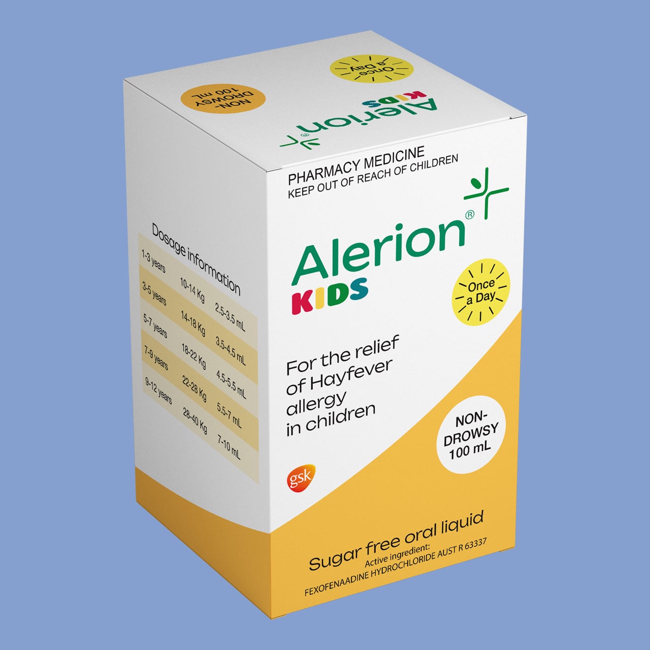
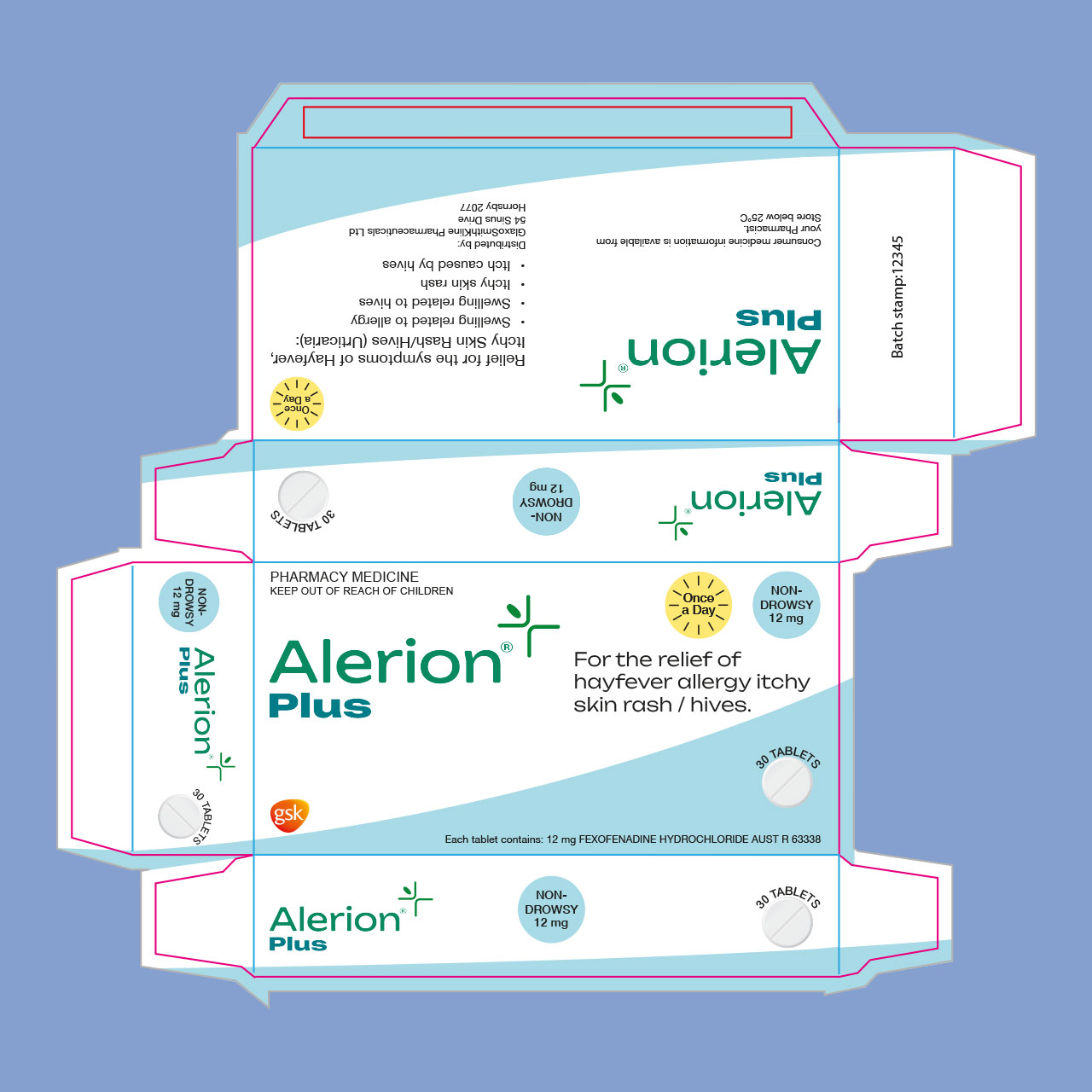
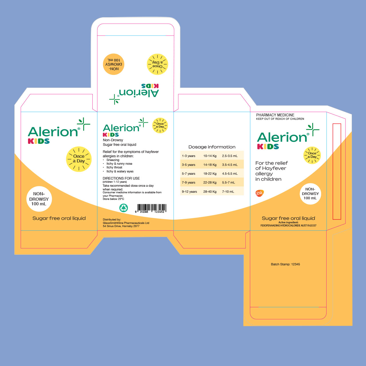
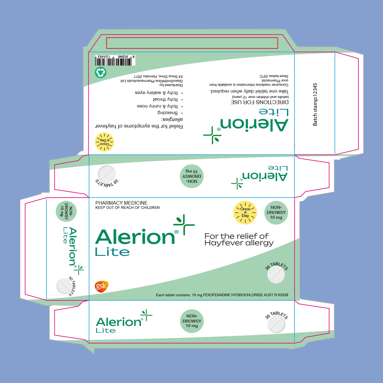
Consistent shapes and design elements are used across all products to create a cohesive brand identity. Each variant is distinguished by its own colour scheme. The packaging uses simple layouts and limited elements to ensure the boxes are easy to read and quickly identifiable.

How it’s made:
The base logo was created with Helvetica font along with the logomark in illustrator. This was then duplicated for the 3 versions to ensure brand consistancy. The lite and plus versions use x font while the kids version uses alphabet soup.
The plus and lite versions were designed to have distinct colours, ensuring that customers do not confuse the two products. The kids box was designed to look similar to the other boxes while still having brighter colours and the different shape for the liquid bottle.

Credits:
Mockups:
‘Mock-up playing card’ from Mock-up Free
‘Free playing cards mock-up’ from Mock-ups Design