
Portfolio
Makai
Illustration, Marketing, Packaging
Brief:
Develop a unified brand identity and packaging design for a hydration focused sports drink, targeting surfers as the primary demographic. The brand should capture the energy, freedom, and culture of the surf lifestyle while clearly communicating performance and refreshment.
Solution:
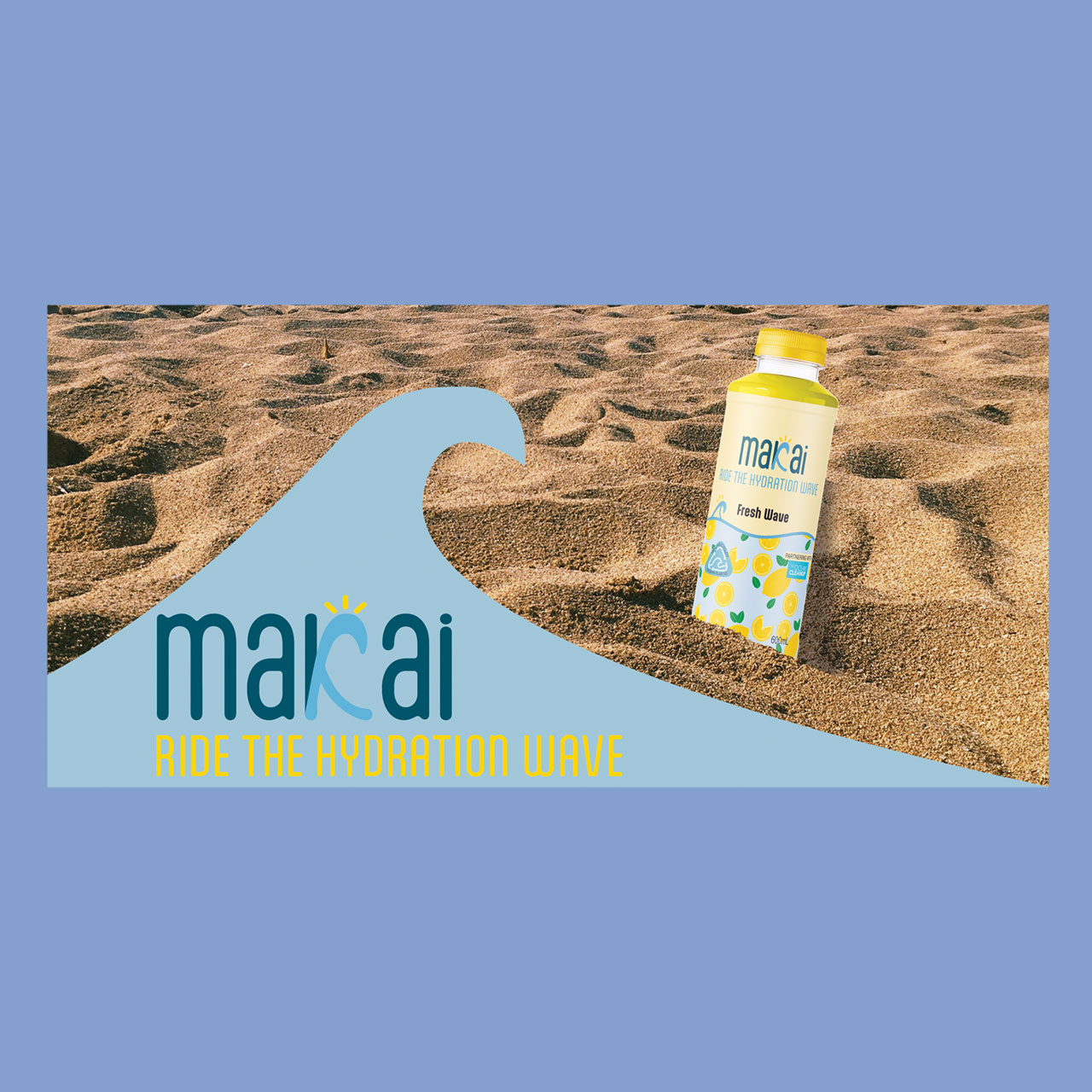
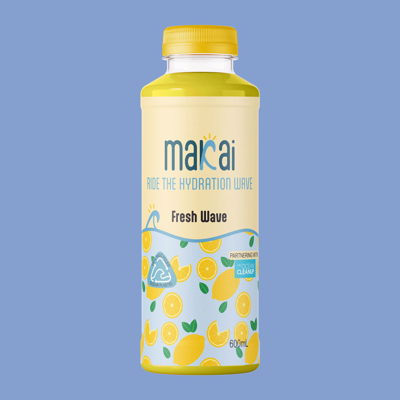
Makai, meaning “to the sea” in Hawaiian, captures the energy and freedom of surf culture. Designed for surfers, the brand blends ocean inspired tones, fluid typography, and bold graphics to reflect movement and sun.
How it’s made:
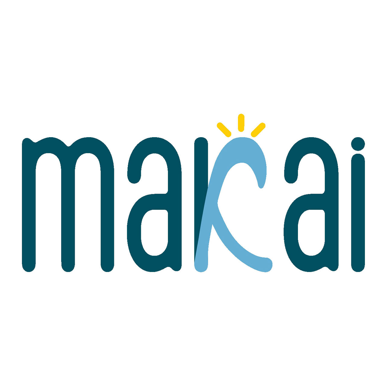
The logo was developed using the base typeface Aptly Regular. The letter K was customised by using the original letterform as a base and refining a series of wave-inspired variations until it clearly represented both the letter and an ocean wave.
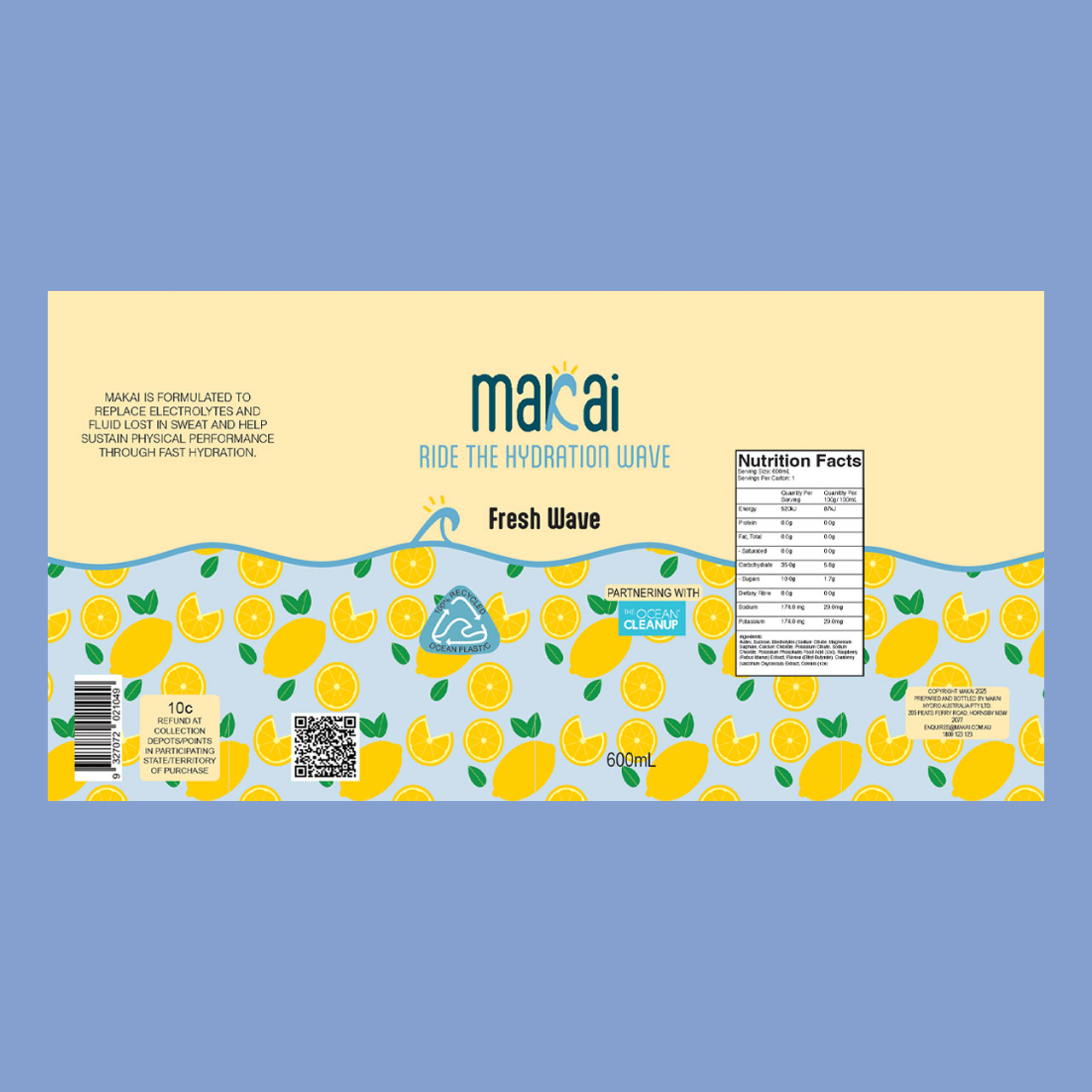
The pattern was created in Adobe Illustrator using the Pattern Tool. The final label was then assembled in a separate Illustrator document, combining the logo, pattern, and supporting graphics into the finished design.


Credits:
Images:
Makai background by Elena Ktenopoulou on Unsplash
Mockups:
‘MD903 orange juice bottle mock-up’ from Mock-ups Design