
Portfolio
Healthy Youth Competition
Illustration, Marketing
Brief:
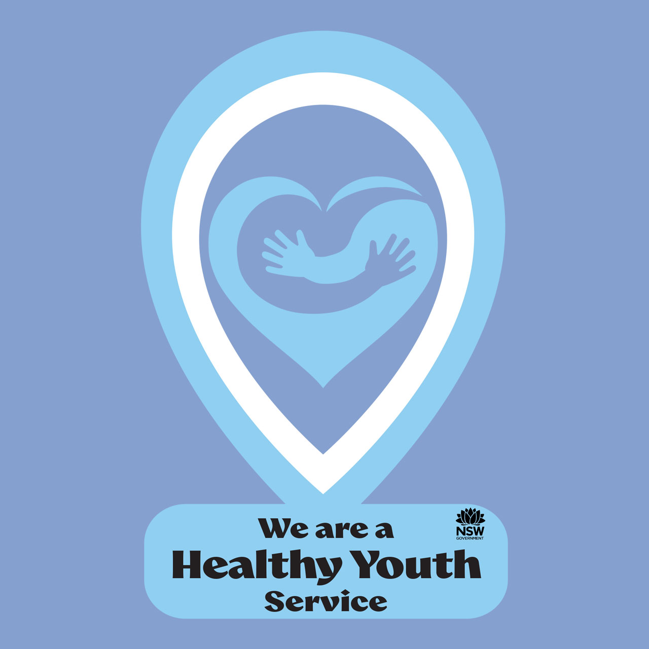
Create a door sticker to indicate that a location is certified as part of Youth Health Services. The design must follow the client’s specified colour and font requirements whilst clearly communicating trust, safety, and official certification.
Solution:
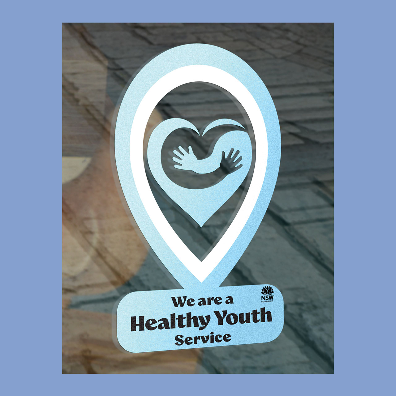
This was awarded second place in the Healthy Youth sticker competition. The heart-shaped embrace symbolizes care, support, and community. Transparency was added to symbolize that anyone is welcome. Combined with soft blue tones and clear typography, the design communicates trust, safety, and a welcoming environment for young people.
How it’s made:
Using the supplied colour palette and font options, the sticker was designed by first creating a heart shape in Adobe Illustrator. The arms were initially constructed as individual shapes to allow the layout and positioning to be refined before being merged with the heart. The overall sticker shape was inspired by location pin stickers, using them as a reference to create a recognisable and engaging silhouette.
Credits:
Mockups:
‘Window signage mock-up’ by Karina Duca on Unblast